
Exer Institute is a tutoring platform designed to provide learners with a comprehensive learning experience while keeping sessions affordable and ensuring tutors are fairly compensated. The platform serves both learners and tutors, with a focus on giving students more control over their learning journey while creating a seamless and valuable experience for both user groups.
Product Designer
Q2 2024
Product thinking
Visual design
Bien Onia
Key workflows felt constrained, interactions were not optimized for touch, and certain patterns made it difficult for users to complete tasks efficiently on mobile screens. This led to confusion, drop-off, and missed opportunities for engagement early in the user journey.
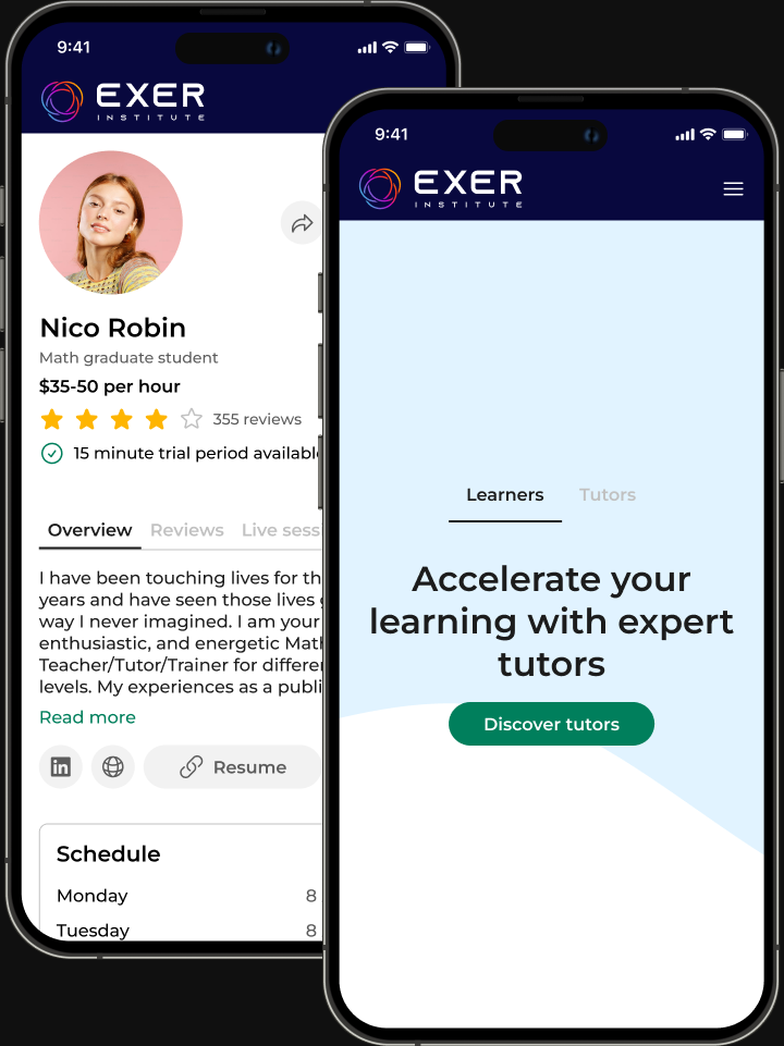
Exer is a digital learning platform designed to help students build skills through structured exercises and practice. The platform offers a range of learning tools—including videos, articles, and practice problems—to support different learning styles and reinforce understanding.
The video section provides guided explanations that help students understand key concepts before moving into practice.
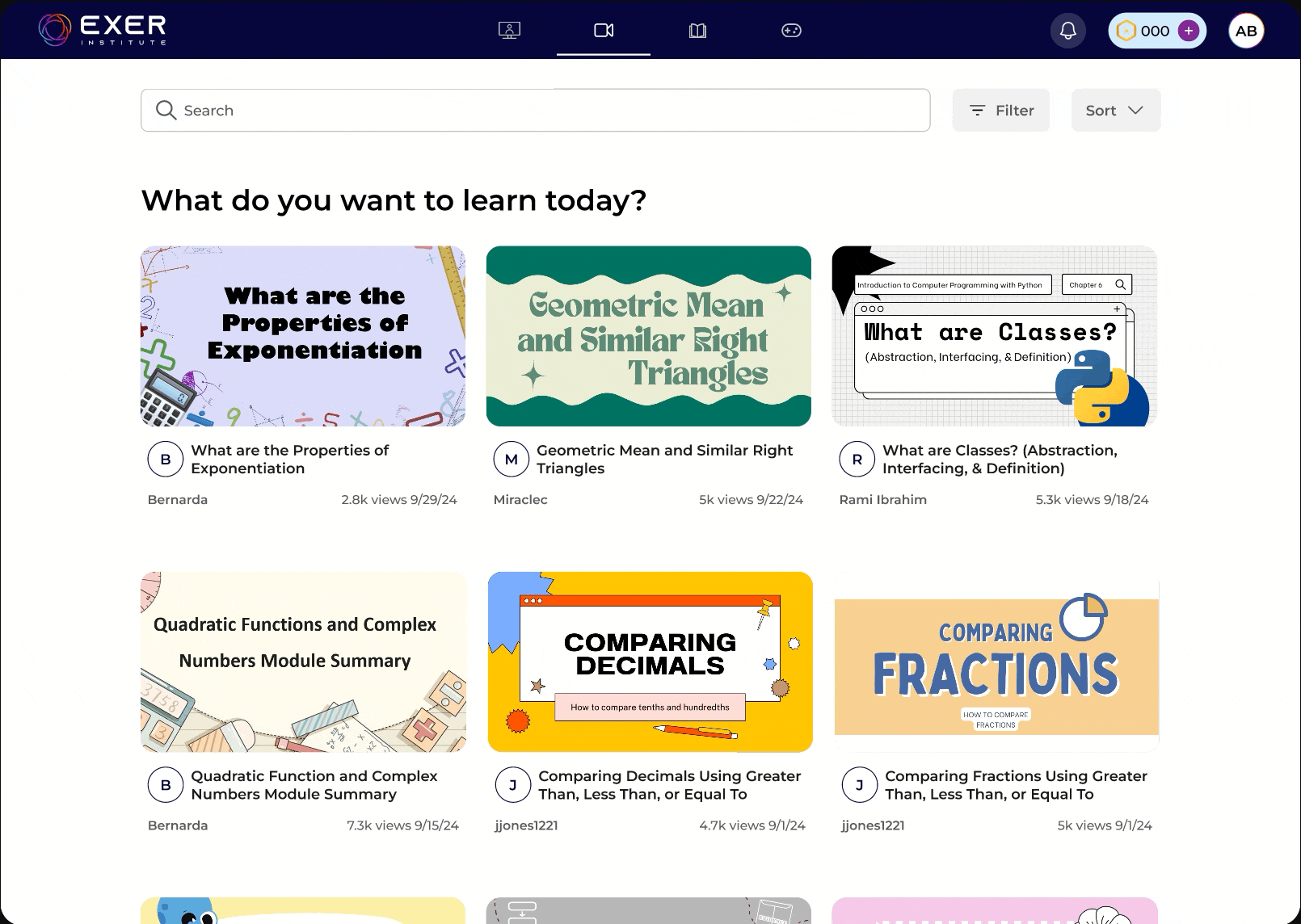
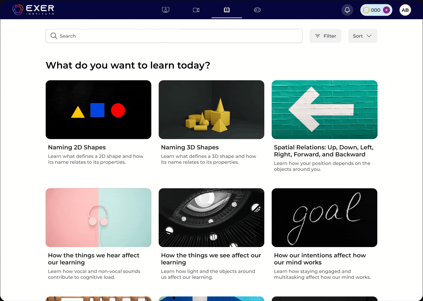
Articles are especially useful for learners who prefer reading or want to revisit concepts quickly without watching a full lesson.
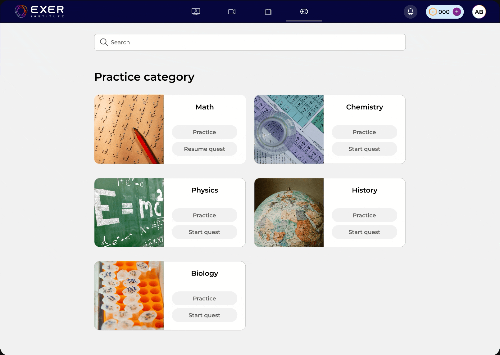
Practice problems allow students to apply what they’ve learned through hands-on exercises. This section reinforces understanding, helps identify areas of difficulty, and gives students a way to track their progress as they continue learning.
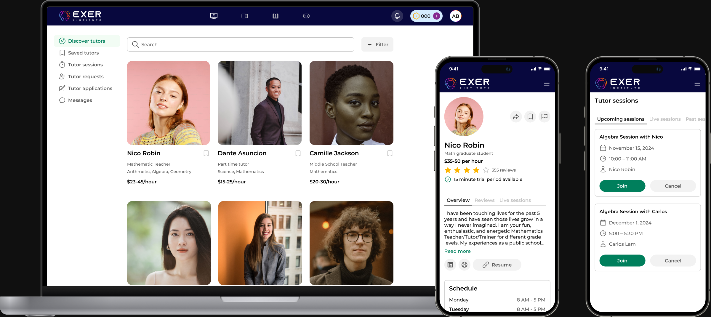
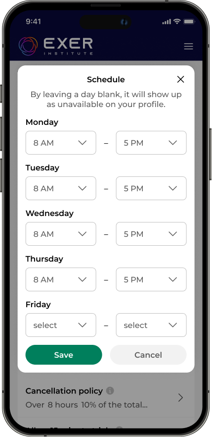
Tutors can offer various session lengths to maximize their schedules with their students.
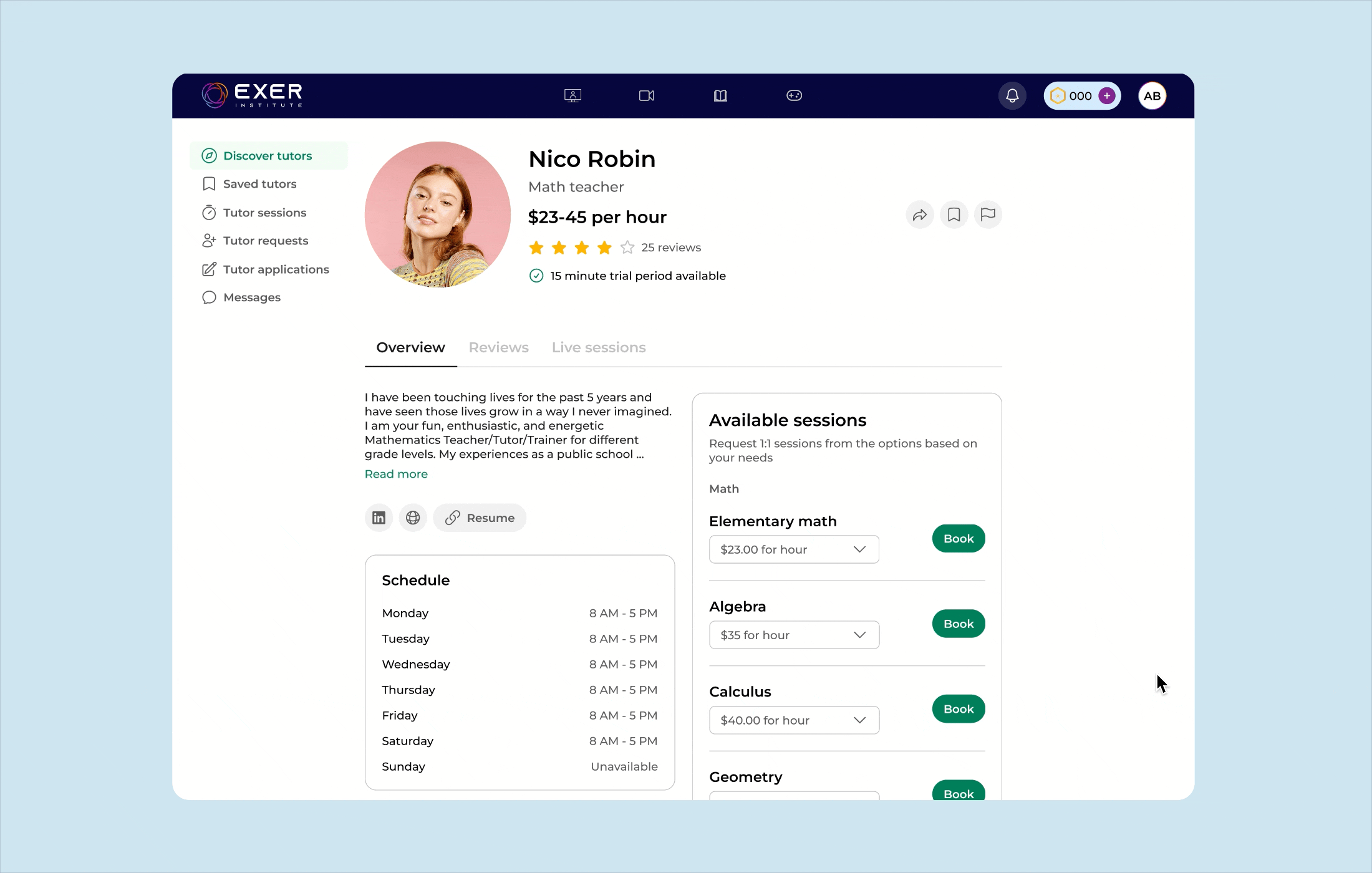
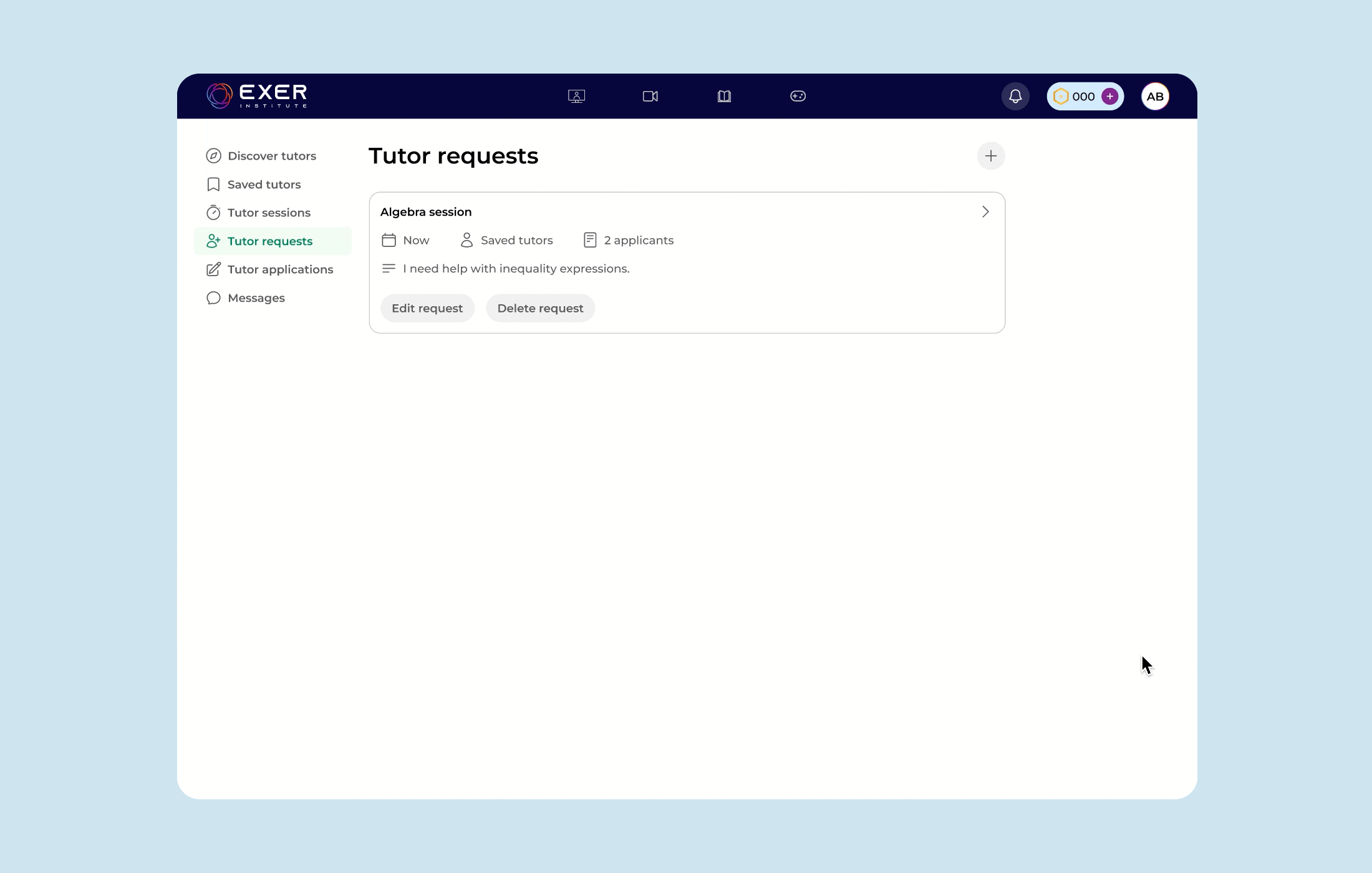
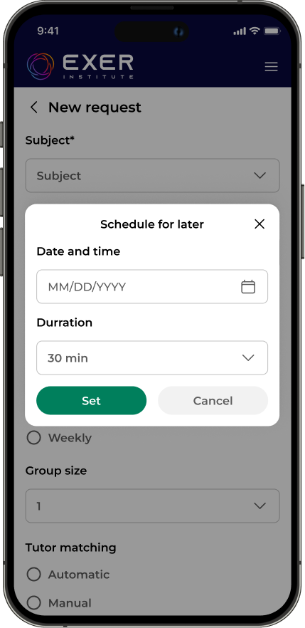
Learners can also submit a request and view the tutors who reply to their request.
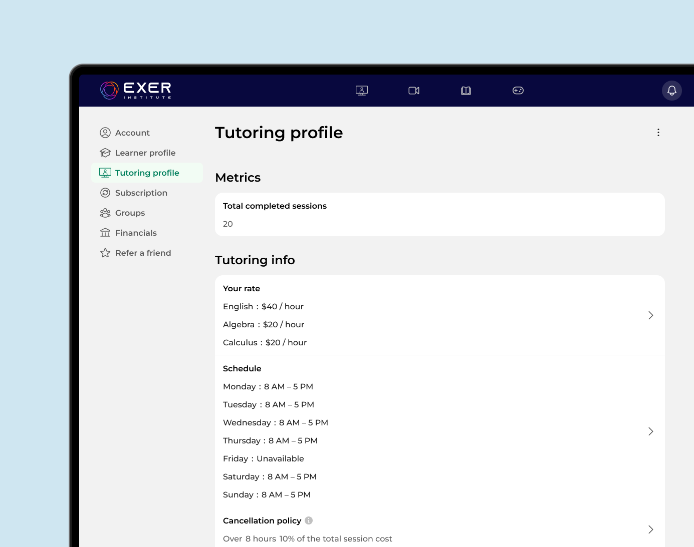
The tutor profile showcases key details such as availability, rates, and cancellation policies, helping learners make informed decisions.
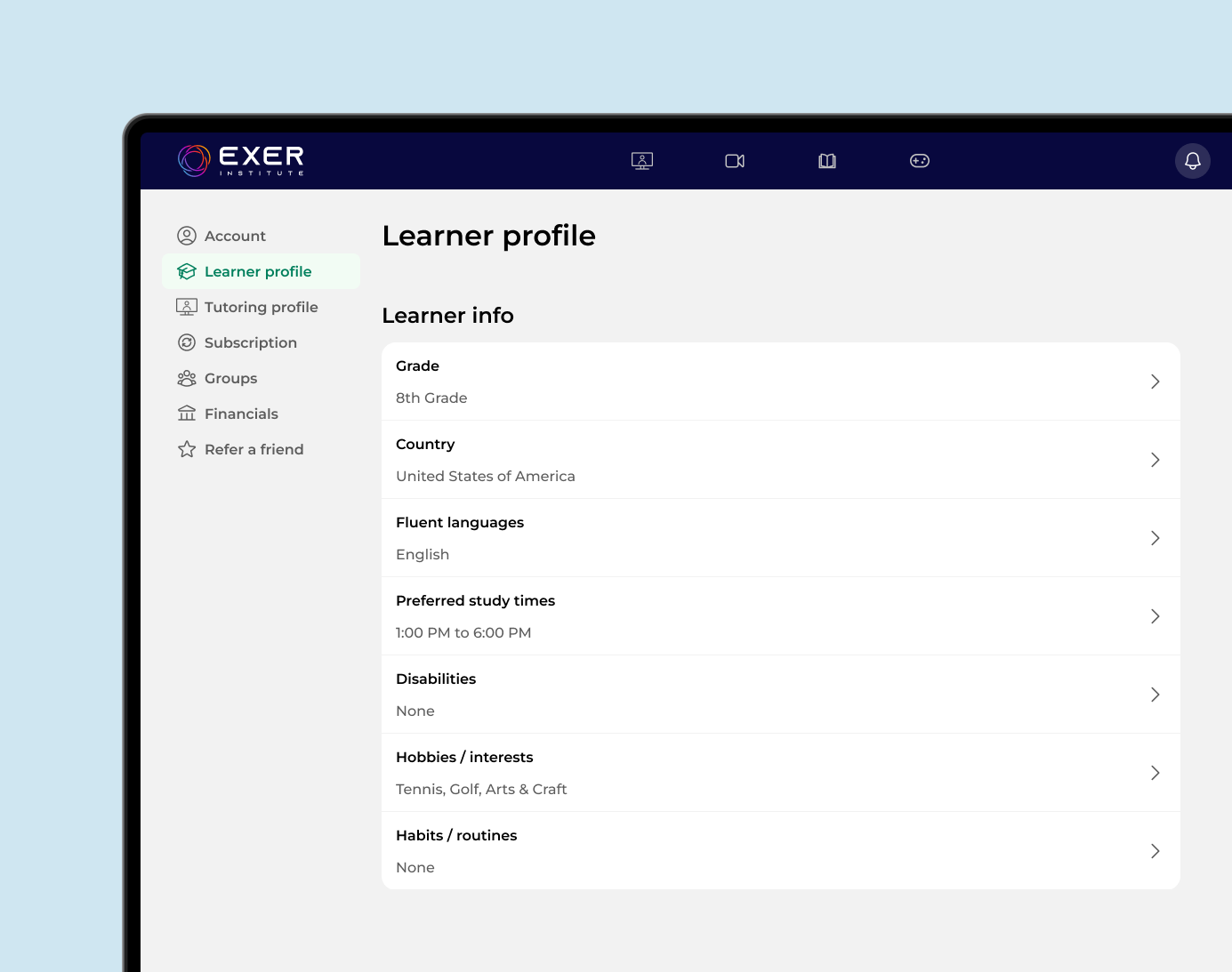
The learner profiles adds relevant information about the learner's goals, preferences, and needs. This not only helps match learners with the most suitable tutors but also allows tutors to tailor their teaching approach for a more personalized learning experience.
After the launch of Exer's tutoring feature, Exer struggled with gaining new users and increasing daily active users.
We noticed that many first-time users were coming from mobile ads, but much of the desktop experience didn’t translate well to mobile. This created friction early in the user journey.
To address this, I focused on optimizing the mobile experience, particularly how modals were presented. I explored patterns such as full-screen overlays, bottom sheets, and dialogs to ensure interactions felt intuitive and seamless on smaller screens.
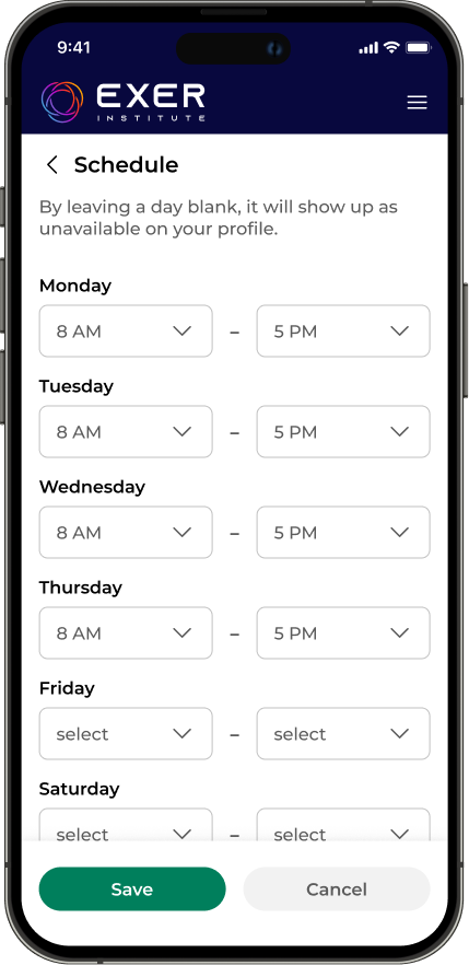
For Exer, full-screen overlays were used for flows that required multiple inputs or more focused interaction. These screens gave users enough space to complete tasks like filling out forms without feeling constrained.
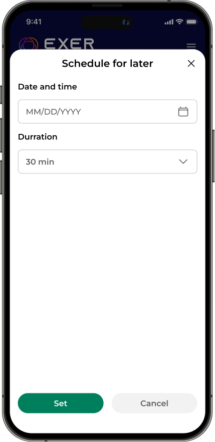
Bottom sheets were used for lighter interactions that required fewer steps. They allowed users to take quick actions or make selections without leaving their current context.
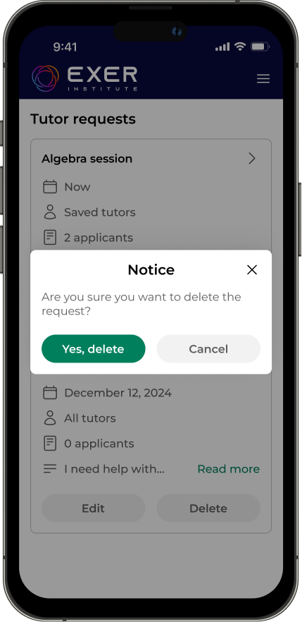
Dialogs were reserved for primarily informational moments, such as providing additional details or confirming user actions. They were used sparingly for confirmations and alerts, ensuring important information was clear without interrupting the overall flow.
By prioritizing the mobile experience, we were able to identify and improve key workflows that previously caused user friction and drop-off. As a result, users were able to complete tasks more easily and stay engaged within the platform. These improvements contributed to a 20% increase in daily active users.
This work highlighted the importance of designing with mobile users in mind from the start. By rethinking interaction patterns for mobile—especially how users complete actions through overlays, bottom sheets, and dialogs—we were able to create a more seamless and intuitive experience.
This reinforced the value of a mobile-first approach, where constraints like screen size and context drive clearer, more focused design decisions. Designing for mobile first not only improves accessibility and usability on smaller devices, but also leads to more streamlined experiences across all platforms.